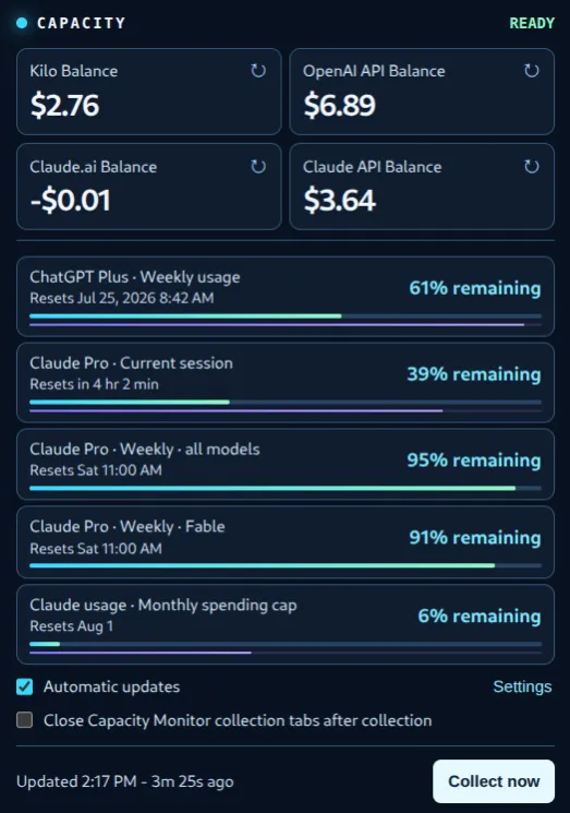
The provider surfaces keep moving: the Fable-specific limit visible in this early screenshot was later removed from Claude’s usage page.
I kept doing the same small, irritating circuit: open Kilo, find the remaining credits; open the OpenAI platform, find the API balance; open ChatGPT settings, find the weekly limit; open Claude, find the session and weekly limits; then repeat some version of it later.
None of those checks was hard. Together, they were a tax on attention. The information I needed was already visible, but it was scattered across tabs and settings pages with different vocabulary, different refresh behavior, and different ideas of what a “balance” meant.
I initially treated that as a dashboard problem. It turned out to be a browser problem.
A dashboard that could not see
The first useful shape was a private GPT Sites–based dashboard: credit balance cards at the top, quota meters below, timestamps, reset windows, and history. It was genuinely nicer than tab-hopping. It also put the hard part in the wrong place.
The values are not a clean, stable API surface. They are displayed inside authenticated provider pages. A separate site cannot simply know what a signed-in browser session can see. So the dashboard needed a collector, and the collector needed to deal with the pages themselves.
That distinction changed the project. Instead of making the dashboard the product, I made a Chrome extension the primary product and treated the dashboard as an optional consumer of a small, normalized snapshot.
The extension has a much more natural job: it runs in the browser that is already signed in, reads only the displayed values from provider pages the user explicitly enables, and puts the result behind one toolbar click. The dashboard can still exist for history or a larger view, but losing the dashboard cannot make the local view stop working.
That is a better boundary than a hosted service trying to impersonate the browser.
The number on the page was not always the number I wanted
Once the collector was looking at real pages, the work stopped being about card layouts and became about interpretation.
Kilo was the clearest example. Its profile page can show both Remaining Credits and a monthly usage figure. The collector initially found a dollar amount and reported it confidently, but it sometimes selected the usage total instead of the smaller remaining-credit balance. A scraper that returns a plausible number is more dangerous than one that fails loudly.
The fix was not “find the first dollar sign more carefully.” The provider reader now scopes its search to the labeled credit card, with text fallbacks for harmless label variations. Its tests include the ambiguous case specifically: a page containing both the usage amount and the actual remaining balance.
Other pages exposed different versions of the same problem. Some balances are stale until a reload. Some pages take time to settle after navigation. Claude reports limits as percentage used in one place and percentage remaining in another. Reset information may be a date, a countdown, or absent altogether. A negative credit balance has to stay negative; it cannot be turned into a positive number by a friendly formatter.
The most important design decision was to make uncertainty visible. The extension keeps a prior verified value when a new reading is suspicious or the page is still loading. It records an explicit collection state instead of quietly changing an unavailable reading to $0.00. The popup can say that a provider needs sign-in, access, another attempt, or is still loading.
This sounds obvious in hindsight, but it was the difference between a neat demo and a tool I could trust. A capacity monitor has to be honest about what it does not know.
Freshness has a cost
The same principle changed the refresh behavior.
The early collector checked on a two-minute interval. That sounded reasonable when the goal was a live dashboard. In practice it meant the extension could reload provider tabs often enough to interrupt active work, make a page look like automated traffic, or simply collect before the page had finished rendering.
The project now defaults to a 20-minute collection interval. Manual collection and individual card refreshes remain available when I want a current value immediately. The settings make the tradeoff explicit: automatic updates can be paused, the interval can be changed, and extension-opened provider tabs can be closed after collection.
That is a small product choice with a useful general rule behind it: “more current” is not automatically better when currentness requires disturbing the thing being observed.
The popup also needed to earn its compactness. The first version fit a collection of balances and quota percentages into a narrow browser dropdown. Then it gained reset timestamps, age indicators, and a second meter that shows time remaining until a reset. The first meter answers “how much capacity is left?” The second answers “how much time is left?” Those are different questions, and seeing both removes the mental math that sent me back to the source tabs in the first place.
Clicking a reading opens or focuses the provider page behind it. The popup is a control panel, not a fake copy of every provider dashboard.
Local first, with an escape hatch
The result is AI Capacity Monitor, an open-source Chrome extension that currently collects twelve metrics across eight provider surfaces: balances, counted credits, and subscription quota windows from Kilo, OpenAI, ChatGPT, Claude, xAI, Gemini, and Google One. It is useful with no service running behind it. Provider access is requested one provider at a time, and the extension never asks for credentials.
There is still an optional path outward. The extension can emit a versioned, normalized snapshot to a local bridge or user-configured HTTPS webhook. That makes a history dashboard, a notification service, or some other future integration possible without making any one of them required. The local bridge uses a per-install secret and validates the snapshot before forwarding it; a failed publisher never prevents the popup from showing the last local readings.
That separation took some deliberate cleanup. The project now has a documented provider-support matrix, a privacy policy, explicit permission explanations, fixture tests for parser behavior, deterministic extension packaging, and a guided first-run setup. It also has a public-product direction without pretending that provider pages are permanent APIs. Their layout can change; that is a maintenance fact, not a reason to hide the limitation.
The extension is still at version 0.1.0, and I have deliberately not submitted it to the Chrome Web Store. Before that happens, it needs sanitized listing screenshots and an unlisted beta round. Making it useful for me and making it safe to distribute are different jobs, with different standards for privacy, permissions, support, and updates. I would prefer providers expose supported APIs for these values; until they do, scraping remains both the mechanism and the maintenance burden.
Taking the snapshot off the browser
Once publishing was separated from collection, the same snapshot could support something more tangible: a small ESP32-2432S028, better known as the Cheap Yellow Display or CYD. The optional local bridge exposes a separate read-only endpoint, and the device polls it for the normalized snapshot. One screen shows balances; another shows quota capacity, reset windows, and the same two kinds of progress bars as the extension.
The browser still owns collection and provider access. The CYD receives no cookies or provider credentials, caches its last validated snapshot through short outages, and uses touch navigation to move between views. Its backlight can even follow the office illuminance reported through Home Assistant and MQTT.
The hardware is fun, but the boundary is the useful part. Because the extension publishes a contract rather than a dashboard-specific payload, a web dashboard, a notification service, or a desk display can consume the readings without becoming responsible for collecting them.
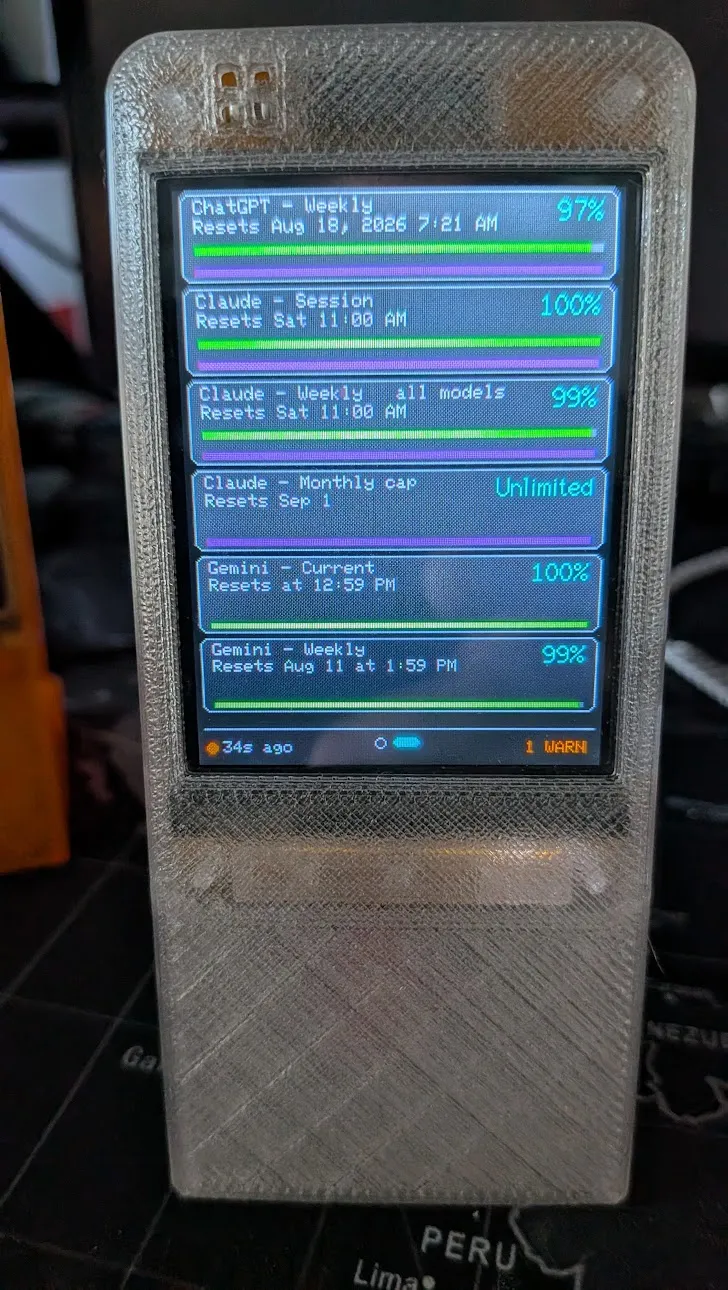
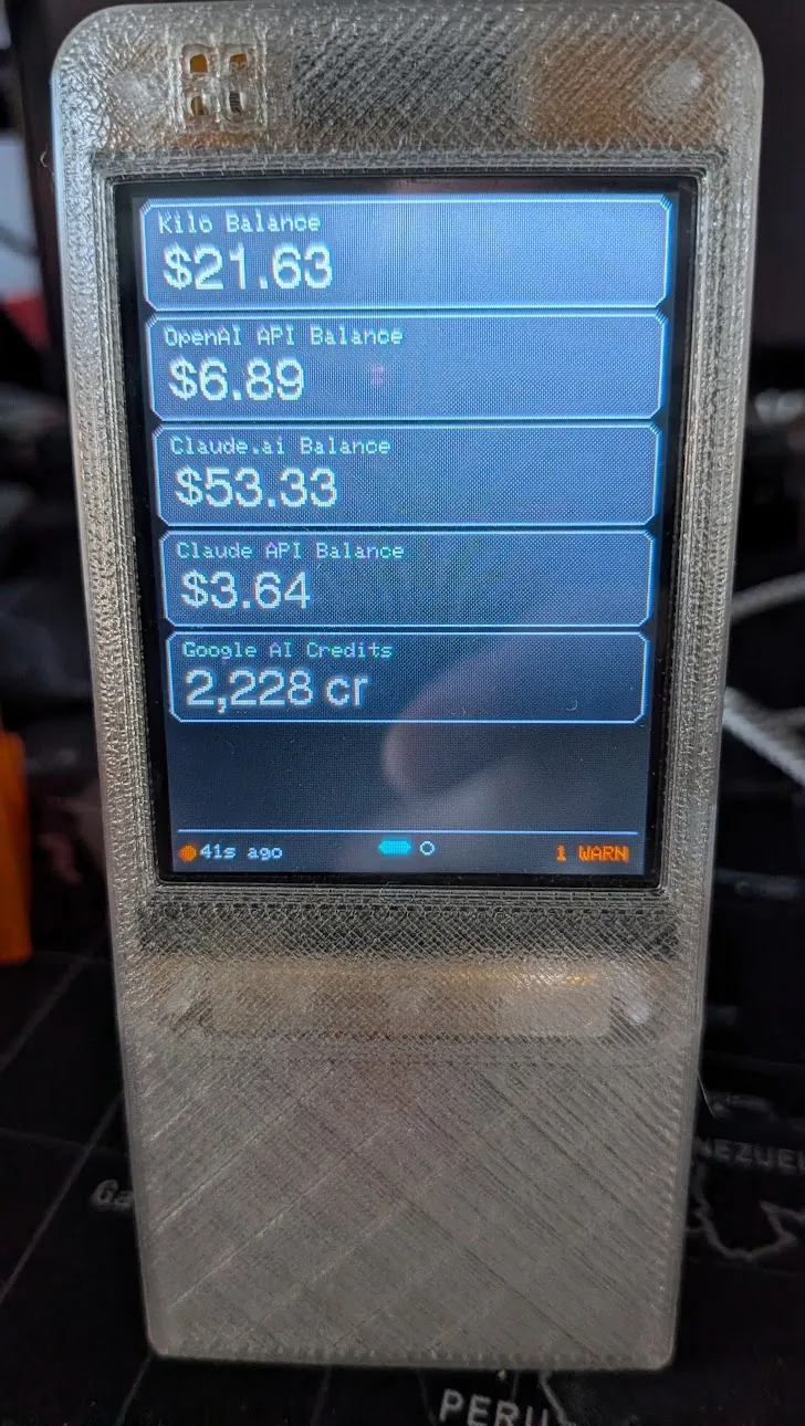
But the original problem is solved in the modest way that matters: one click now shows the handful of numbers I used to hunt for across a browser full of tabs.
The lesson is not that every scattered web workflow needs a dashboard. Sometimes the right interface is a small, local view next to the places where the data already lives. The harder part is deciding what “current” and “correct” mean when those places are designed for people, not integrations.